BTS: 3.3.1 Raincloud chart
My typical writing process revealed!

If this were a movie, it would be one of those where you, the audience, are dropped in the middle of an action scene, without knowing what has happened before. Who are these characters and why are they doing what they are doing?
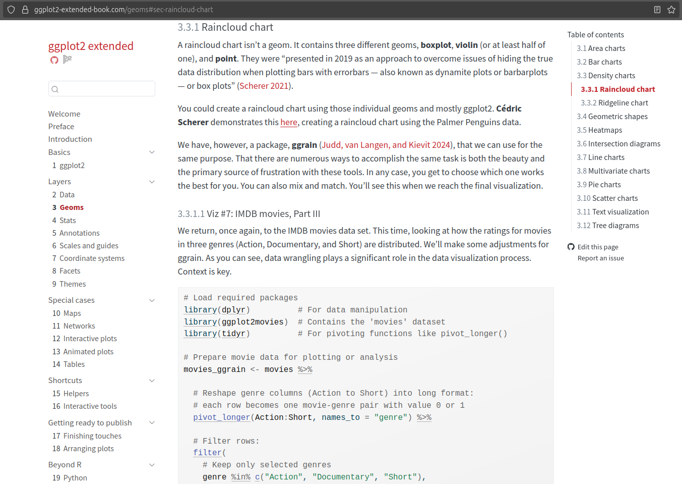
Well, this is ggplot2 extended. We are starting from 3.3.1 instead of 1 (or Welcome, or Preface, or Introduction) because 3.3.1 Raincloud chart is the newest section of the book that was published (online). I will write one or more posts about the earlier chapters/sections, but I decided to start with the one that I remember the best.
This Substack channel is supposed to be about the behind-the-scenes stuff, after all. And it’s easy to forget details if I don’t write them down as soon as possible.
But stick around, and I promise you’ll learn something new while here.
My Writing Process
I have two repositories (repo) on GitHub. ggplot2-extended-book is the public one and contains all the files for the book. ggplot2-extended is the private sandbox for all my tinkering. During the first two years of this book project, I reviewed hundreds of R packages. And for the most part, I have working code for those that made it into the table of contents.
Since this is the first one of these, here’s a typical process for writing a section:
Open the ggplot2-extended project in RStudio
Open the .Rmd file I created (I’ve since moved from using R Markdown to Quarto) when I was conducting research for this chapter. For instance, I started working on the code for this section on November 4, 2023. It might be surprising to hear how long it took me to reach this point. But having conducted extensive research now enables me to write and publish a section every week. Time well spent.
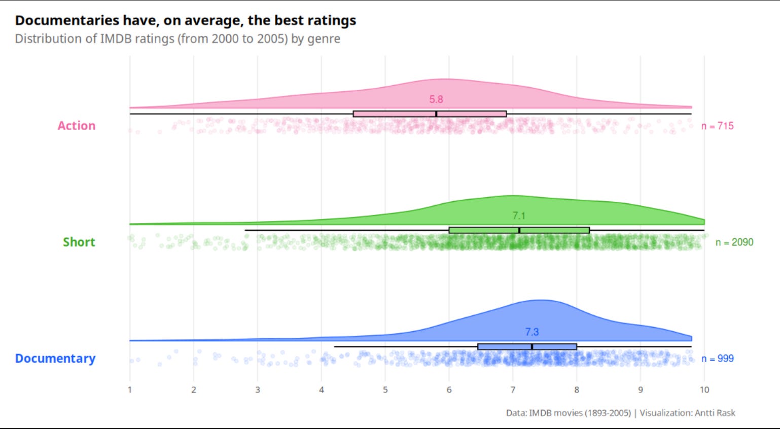
Things may have changed in almost two years. Packages have been updated, or I might decide to use a different data source. I review the code to determine if I need to make any changes before writing the section. In the case of 3.3.1 Raincloud chart, the code I had was straightforward. Just the sample code from the ggrain documentation.
If this happens, I need to write some more code. In this case, I went down a couple of rabbit holes:
First, there was this vignette that had more advanced examples of using the package.
Then, I remembered that Cédric Scherer had a blog post about the raincloud chart (on June 6, 2021).
Finally, I remembered that I had seen a similar one by Matt Dancho on their website (on July 22, 2021). It turned out that Matt was also inspired by Cédric’s post, and for the book, I ended up using only Cédric’s original.
For the book, I didn’t want to use a carbon copy of anyone’s code. Bits and pieces here and there are fine. So I ended up writing new code that was partly inspired by Cédric’s blog post. By the way, this was the most I’ve copied anyone’s code for the book so far. And I felt like I needed to run it by Cédric if it’s okay. We happen to know each other. And that makes it easier. But, creating this book, I’ve also messaged people I’ve never met before. I’m constantly surprised by the positive reception.
Among the things I changed were colors. R has some great color palettes, but sometimes it’s fun to start from a blank slate. For that, I turned to a fun tool/website, Coolors (free version). You can randomize a five-color palette. You can also lock one or more of them. It will then randomly generate new colors that match the chosen colors to some extent. I can recommend trying it!
After the code is done, I open the ggplot2-extended-book project on RStudio (in another window). I tend to add the code blocks in the Quarto document (in this case, Geoms.qmd). I break them down into small enough pieces, the way I explain the code in the corresponding section of the book. At this point, I write “blah blah blah” (true story) instead of Lorem ipsum as a placeholder to denote the text that will come later. Sometimes I write a sentence or two to remind myself what should be covered in that text block.
Now it’s time to write the text itself. At this point, thanks to the code blocks, it’s pretty self-evident what I should write. I more or less have the thoughts ready in my head, and I write them down. I don’t stress too much about grammar, etc., at this point. I want to record the thoughts that come to mind.
After the first round of writing the text, I render the combined text and code to a local HTML web page. This helps me see what the text, tables, and images will look like in the final product. It’s also easier to copy and paste everything on the page for the next part of the process.
I take all the text and insert it into Hemingway Editor (free version). It’s a great app that helps me simplify the text. I’m also using Grammarly (paid version) to check for grammatical errors.
When I’m happy with the text and code, I render everything (not just the edited document). This updates all (cross-)references, not just the latest document.
After Quarto has rendered the documents, it’s time to commit the changed documents to GitHub. This triggers Netlify to deploy the new version of the book to the ggplot2 extended website it hosts. After this, it’s time to notify people on LinkedIn and Substack that a new section of the book is now online.
That’s it, in a nutshell. Rinse and repeat enough times, and I’ve finished the book. Easy, right?!
That’s enough BTS for this section of the book. More next week when I discuss 3.3.2 Ridgeline chart, which has an interesting backstory…
Did something surprise you in the description of my writing process?
Were you aware of those different tools to help you write better/faster?
Let me know in the comments!